BRANDING
DITARE KAFE
Art Direction | Graphic Design | Packaging | Vehicle Signage
Ditare Kafe is a roasted coffee brand with exclusive distribution in hotel and catering establishments in Bizkaia. The word Ditare means thimble in the Basque language, Euskera. It symbolises the soul of express coffee whose essence appears in the first seconds of its extraction: "A thimble of Coffee".
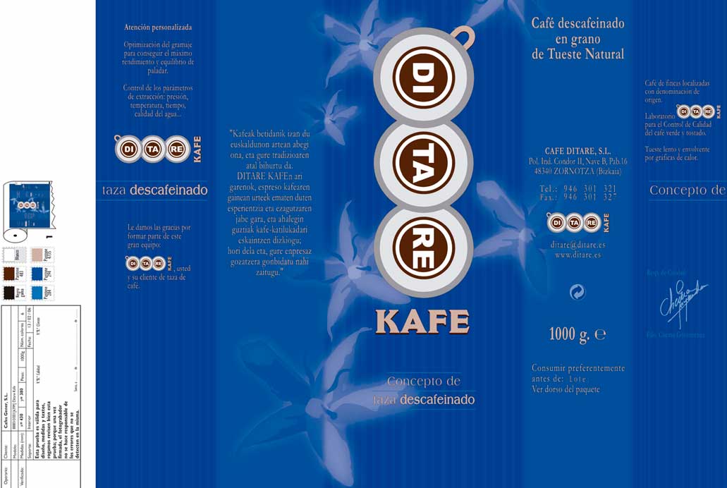
Under these premises, a corporate visual image was designed that would compete with the top range of coffees already established in the sector.
As an essential and common element of its packaging, the design of the coffee flower, "Rubiaceae", also known as "Star Flower", stands out.
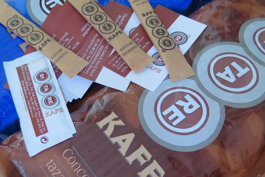
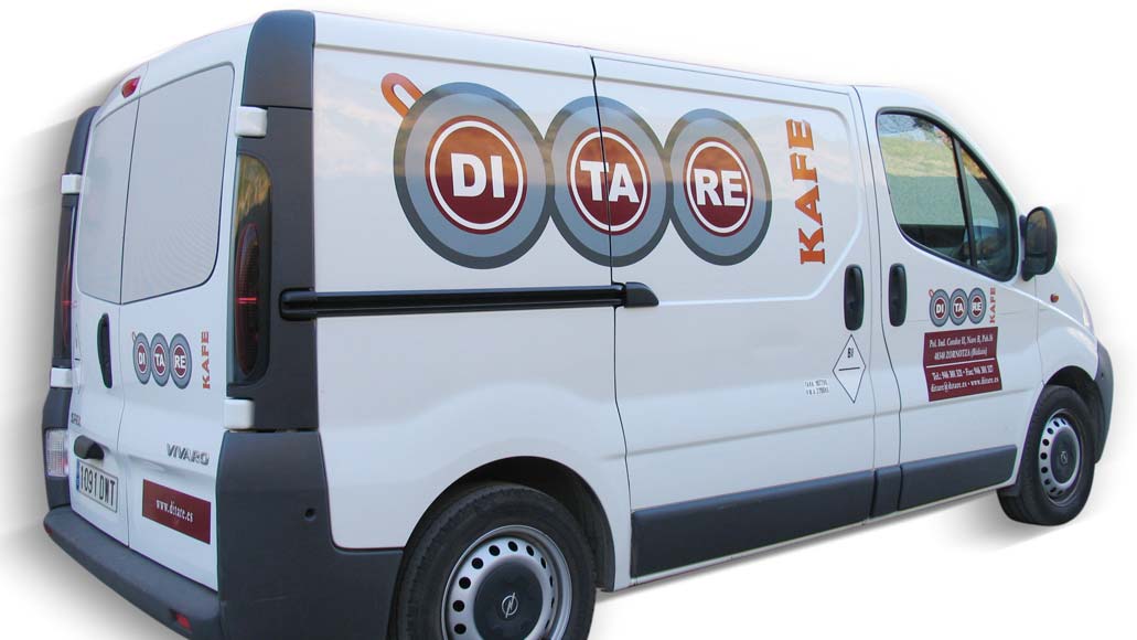
The curved lines of cups, separating the brand name into syllables, would help towards its rapid visual memory. The design of the different corporate communication materials for this coffee brand was successfully completed: packaging for its natural and decaffeinated instant coffee, teas, infusions and sugar sachets, and simple signage for its commercial vehicles, which are an attractive lure on their distribution route.
All rights reserved for images, whereby they may only be used with the express consent of the author. Paloma Luzarraga
Art direction, graphic design, packaging and commercial vehicle markings for Ditare Kafe, roasted coffee distributed in hotel and catering establishments in Bizkaia.


